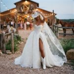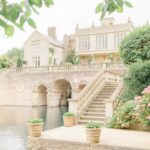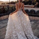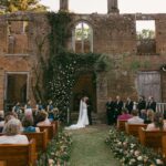
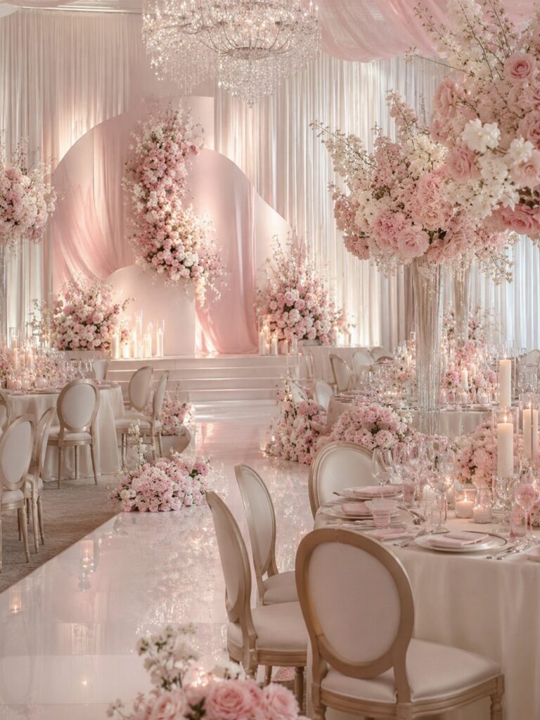
Blush and champagne need different placement than burgundy and gold: one works as an all-over wash, the other needs white space to breathe.
Blush and champagne photograph beautifully in natural light and fit a garden or vineyard where the setting already provides warmth, while navy and burgundy hold contrast in a ballroom with formal architecture.
HEX codes help when ordering online, but printed cardstock and dyed fabric rarely match the screen exactly, so ask for physical swatches before committing to linens or paper goods.
1. Blush and Champagne
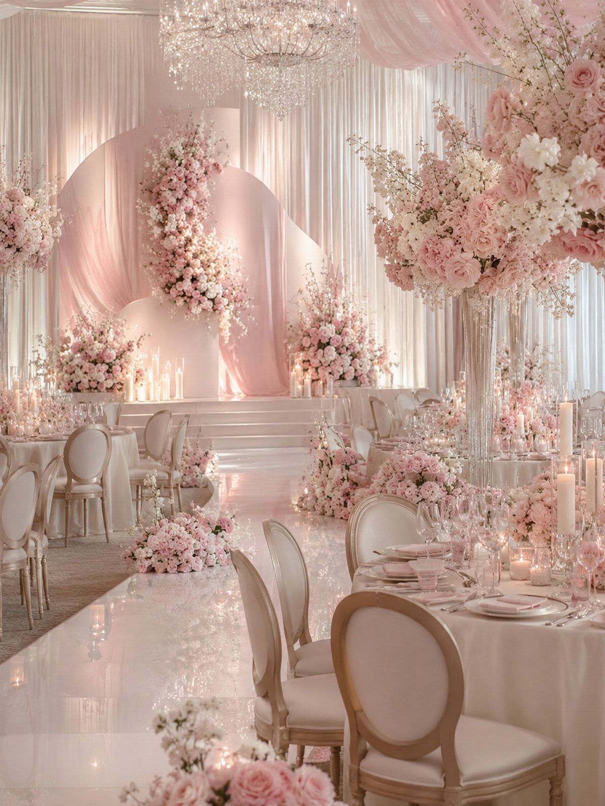
Blush and champagne anchor a palette that feels refined without landing traditional. The soft pink tones read warmer than white but stay neutral enough to work with almost any venue, while champagne linens and chairs keep the look grounded.
Pair blush florals with champagne table runners or napkins, and let the crystal and draped fabric carry the shimmer. The combination photographs beautifully in both daylight and candlelight, which matters when half your budget goes to a photographer.
If your venue already leans warm or beige, swap champagne for ivory to keep the contrast clear.
2. Burgundy and Gold
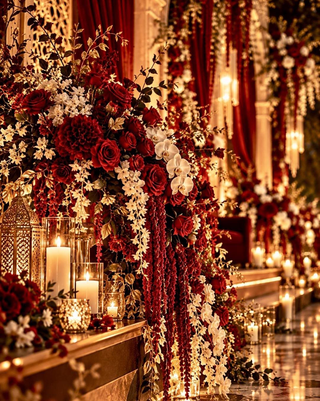
Burgundy and gold suit a fall or winter wedding that wants drama without going moody. The deep red anchors the palette, while gold candle holders and lanterns catch the light and keep the tables from feeling too dark.
Layer burgundy roses with white blooms to soften the intensity, and use pillar candles at different heights to fill vertical space without adding more florals. Gold flatware or chargers extend the metallic without requiring a full linen change.
The palette works best in low or amber lighting. Bright overhead fixtures flatten the burgundy into brown.
3. White Flowers with Lush Greenery
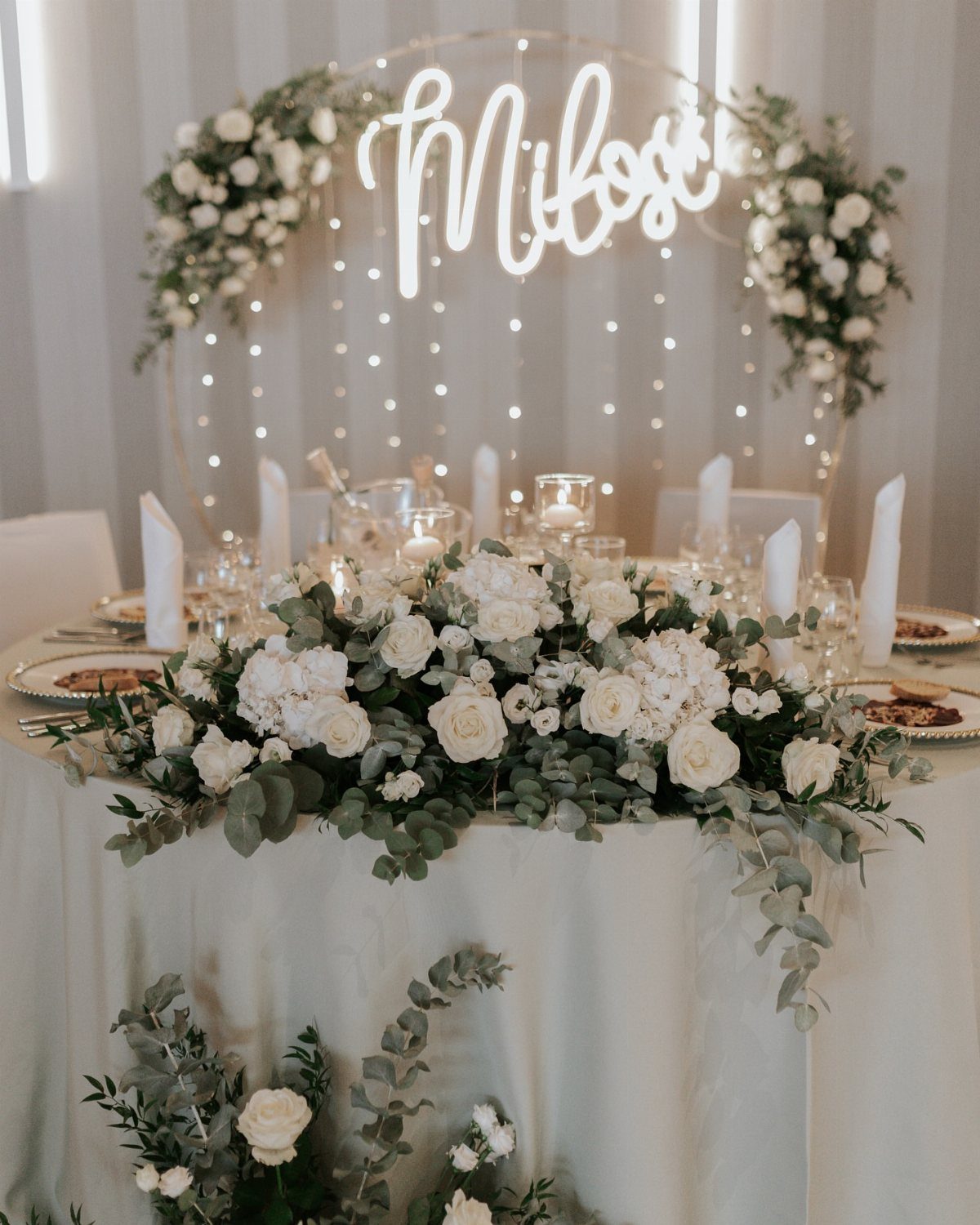
White flowers paired with dense greenery give you a clean, garden-inspired look that scales to any budget. The ratio matters more than the variety: more greenery than blooms keeps costs down and still photographs lush.
Use eucalyptus, fern, or olive branches as the base and cluster white roses or ranunculus at the center. The green anchors the arrangement and lets you skip dyed linens entirely, which cuts one line item.
If your venue has wood tables, leave them bare and let the greenery do the work.
4. Elegant Blush and Gold
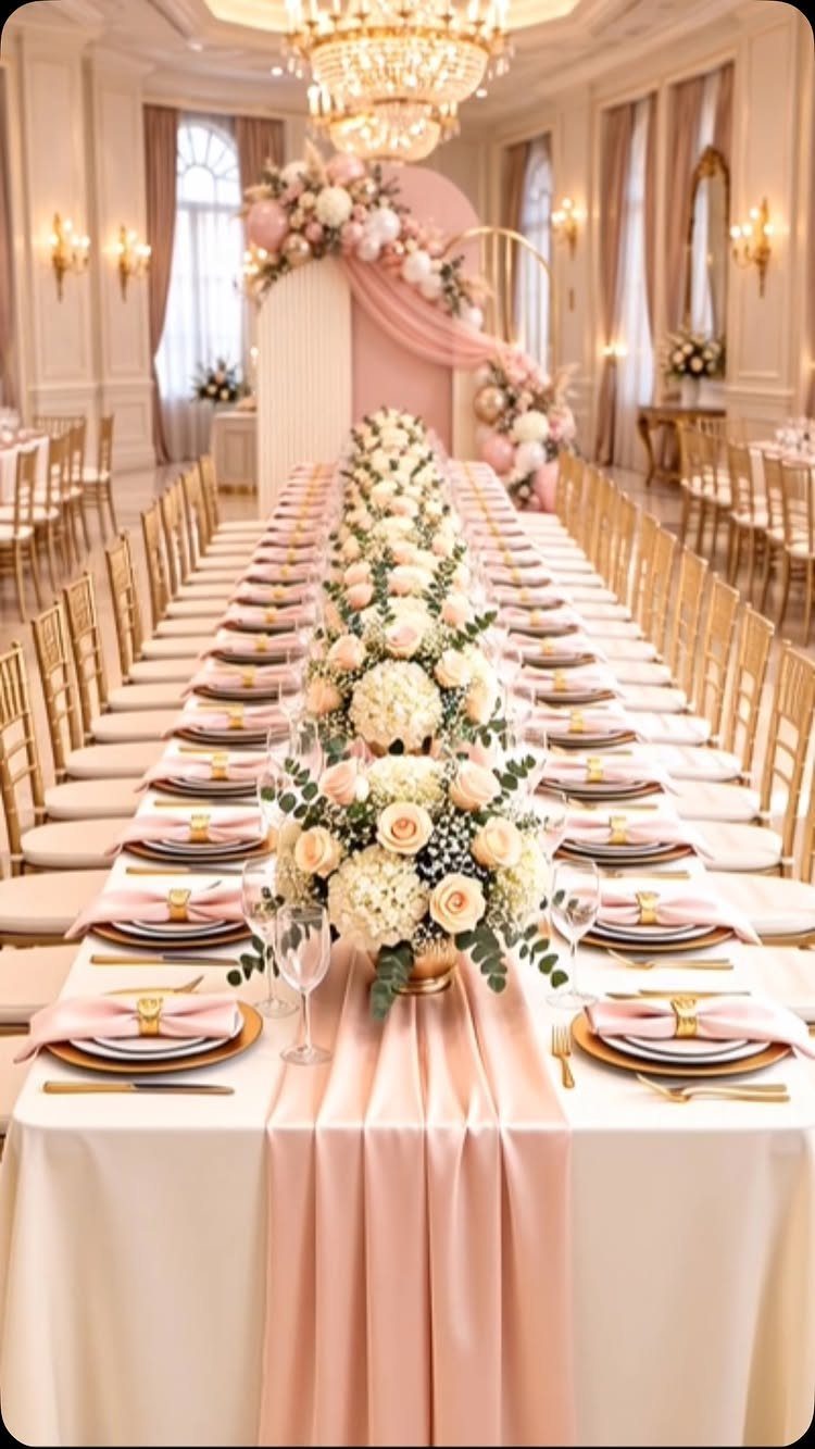
Blush and gold balance soft and formal in a way few palettes manage. The blush runner softens the formality of a ballroom, while gold chairs and rimmed chargers add structure without feeling stiff.
Keep florals low and white so they don’t compete with the pink fabric, and use gold candlesticks or votives to carry the metallic across the table.
The palette photographs especially well with natural light, so it suits daytime or early evening receptions.
Swap blush for dusty rose if your venue lighting skews cool; blush can wash out under blue-toned LEDs.
5. Navy and Burgundy
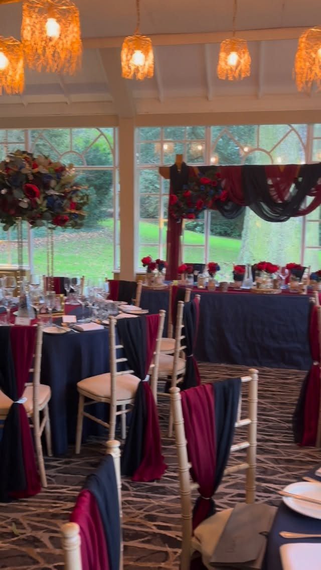
Navy and burgundy deliver contrast without the starkness of black and white. The combination reads formal but warm, which suits a ballroom or historic venue where you want the colors to hold their own against architectural detail.
Use navy as the base for linens and bring burgundy in through florals, napkins, or chair sashes. The 2 colors need white or greenery between them or they blur together from a distance.
Gold flatware or candlesticks add a third layer without crowding the palette. Skip them if your budget is tight; the 2 colors carry the look on their own.
6. Chartreuse Green
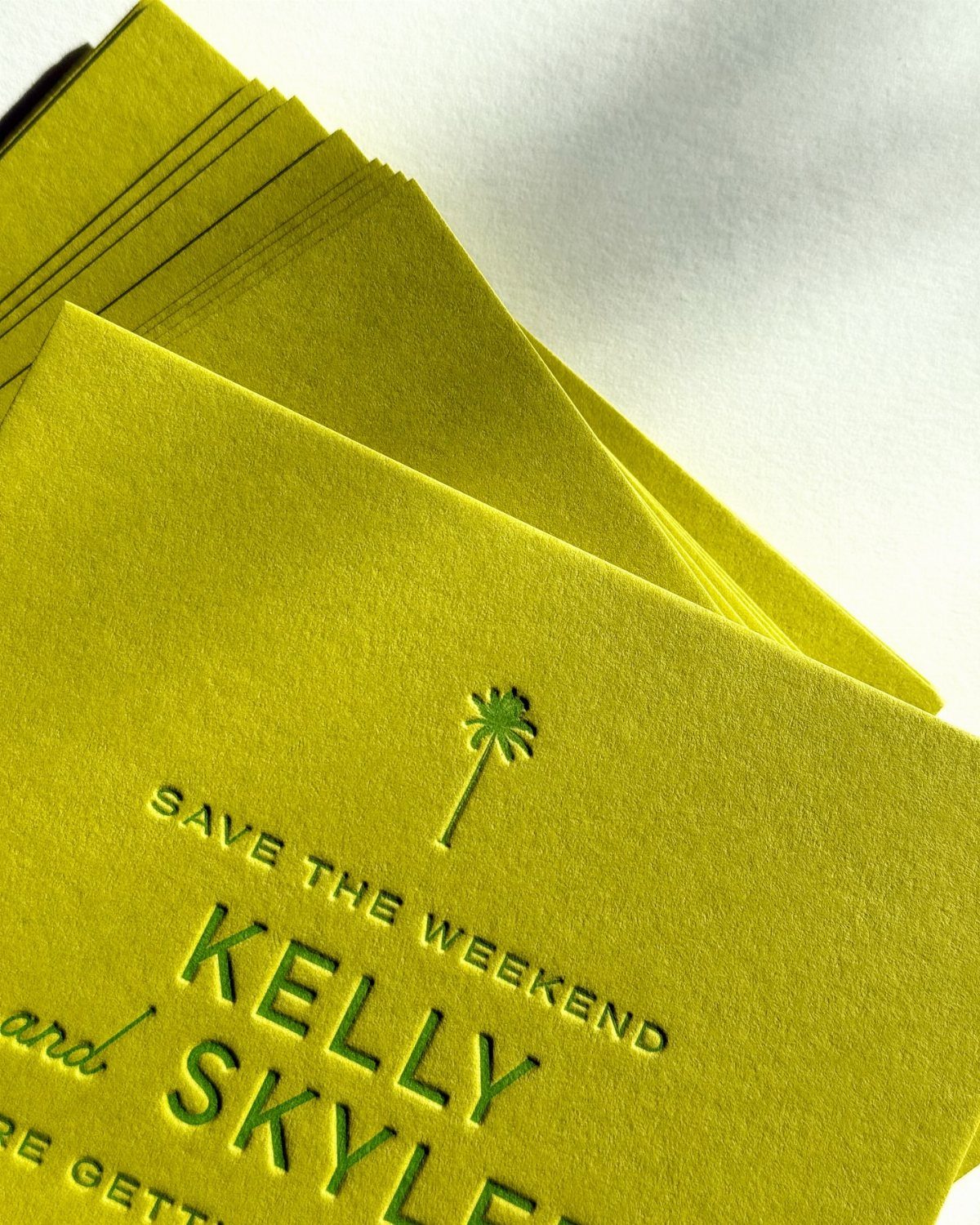
Chartreuse sits between lime and yellow-green, bright enough to register as bold but grounded enough to pair with neutrals.
It suits a couple who wants color without pastels and works especially well for tropical or outdoor weddings where the vibrancy matches the setting.
Use chartreuse for paper goods, linens, or bridesmaid dresses, and pair it with white or cream to let the green stand out.
The color photographs true in natural light but can shift yellow under warm tungsten, so test your venue lighting first.
Small doses go further than full saturation. A chartreuse napkin on a white table reads intentional; an all-chartreuse tablescape can overwhelm.
7. Dusty Rose and Sage
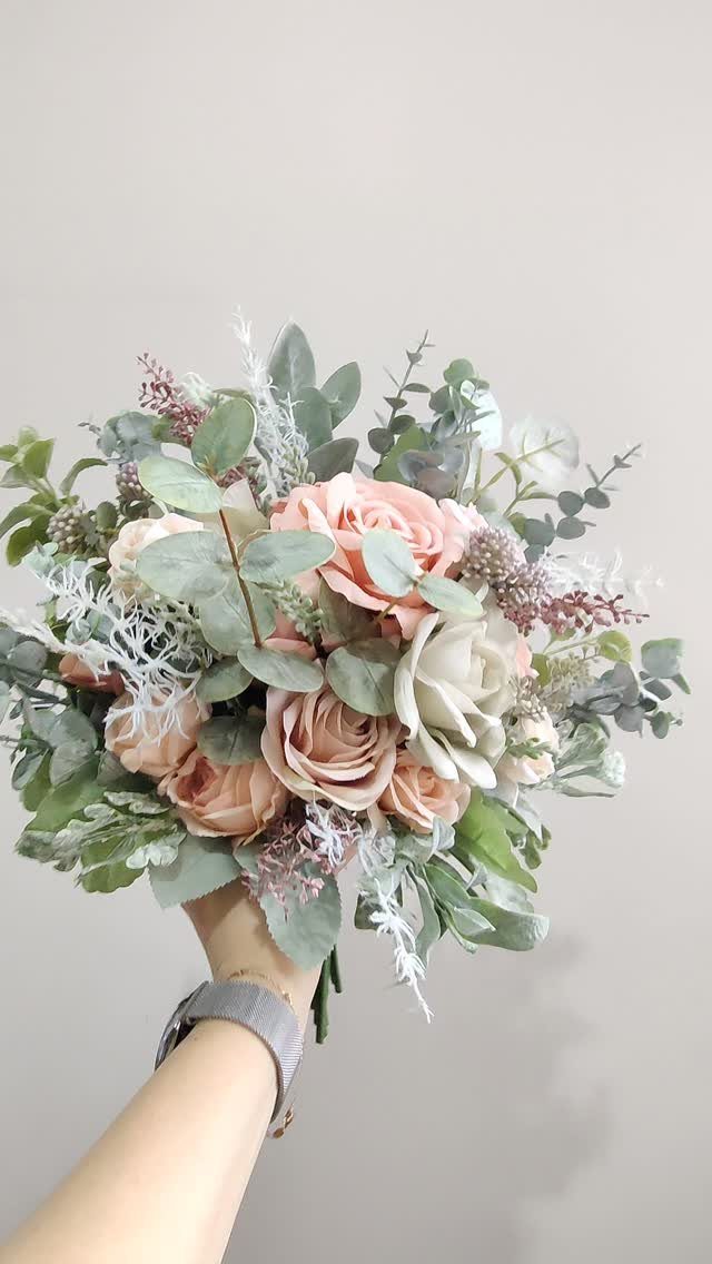
Dusty rose and sage pair the softness of muted pink with the grounded, botanical feel of gray-green foliage.
The combination reads romantic without leaning overly sweet, which suits a garden ceremony or vineyard reception where the natural setting already carries the theme.
Pull sage through eucalyptus, olive branches, or seeded greenery, and keep the dusty rose concentrated in the blooms. The 2 colors photograph well together in outdoor light, where the sage stays true and the rose doesn’t wash out.
If your venue has greenery built in, let it do half the work and spend the floral budget on the bouquets.
8. Blush and Sage
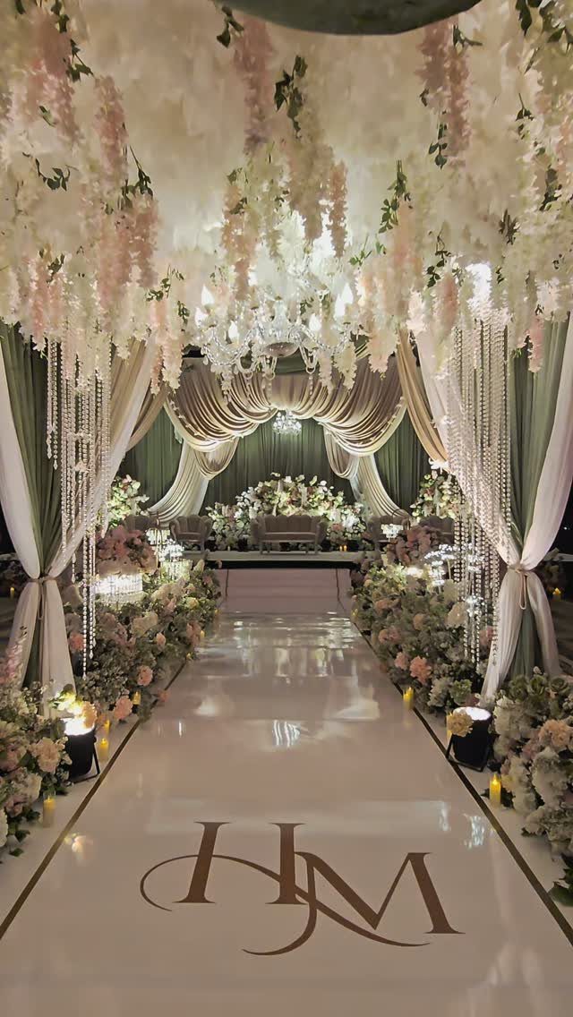
Blush and sage bring botanical softness into a formal space without losing structure. The sage drapery anchors the setup and gives weight to what could otherwise feel too light, while blush florals and hanging blooms add volume overhead.
Use the sage on larger surfaces like fabric runners or backdrops, and layer blush through roses or wisteria where you want texture. The palette suits indoor venues where you need to build the garden atmosphere from scratch.
Gold accents or monograms add a formal touch if the space calls for it, but the 2 colors hold their own.
9. Dusty Blue and Ivory
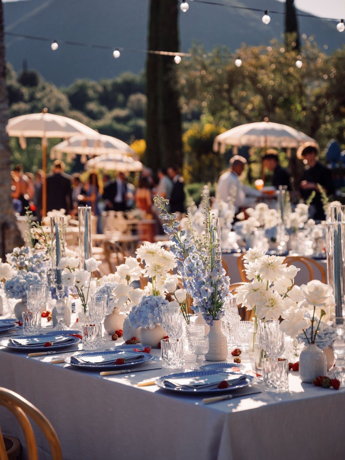
Dusty blue and ivory deliver a calm, understated palette that suits a couple who wants color without heat. The muted blue keeps the look grounded, while ivory linens and florals soften the contrast and keep the table from feeling cold.
Layer the blue through napkins, glassware, or runner accents while the tablecloth stays neutral. The palette works especially well for outdoor receptions where the natural light keeps the blue from reading gray.
If your venue already has cool tones, add warm candlelight to balance the temperature.
10. Sage and White
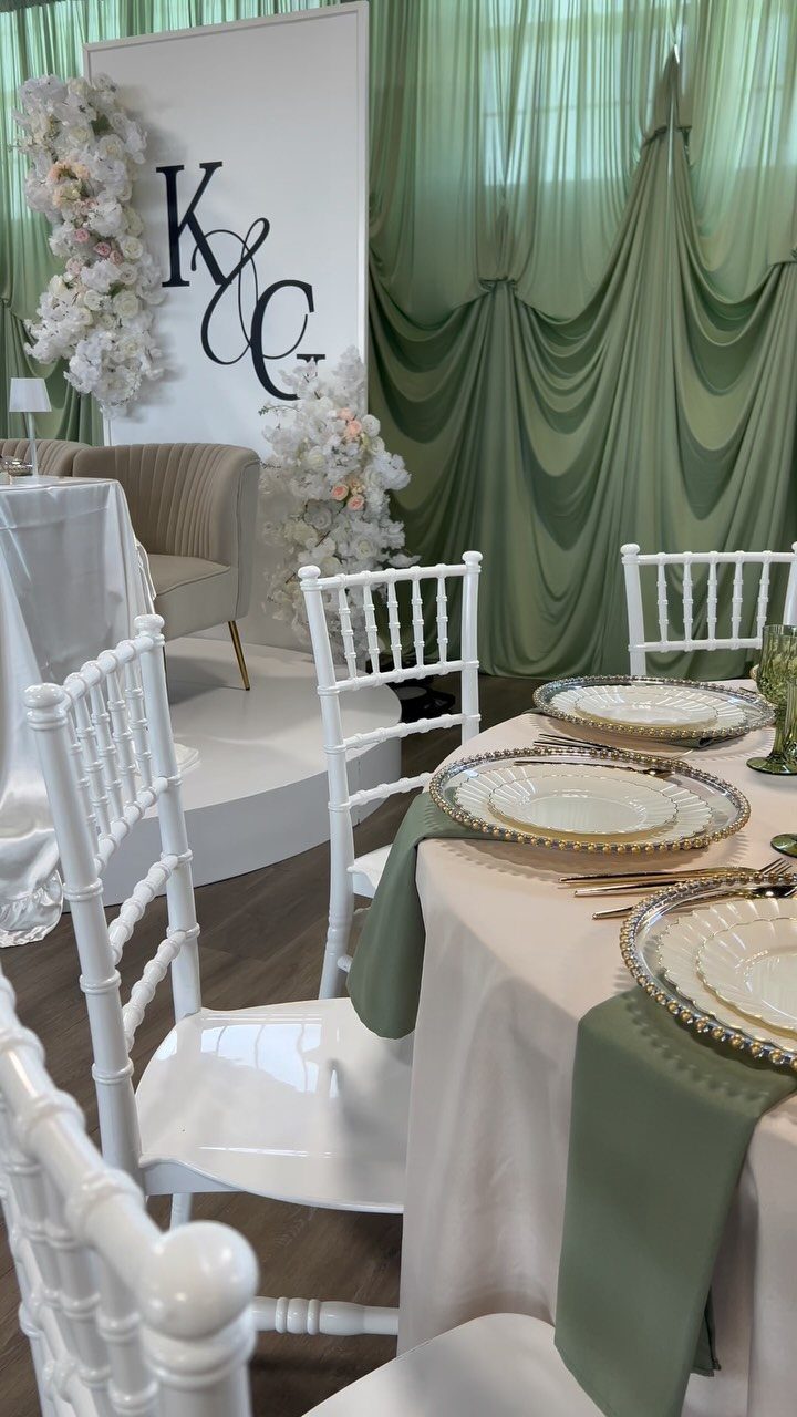
Sage and white give you the clean, airy feel of an English garden without requiring actual flowers to carry the palette. The sage comes through fabric runners, drapery, or chair sashes, while white florals and furniture keep the look crisp.
Use gold-rimmed plates or candlesticks to add warmth without introducing a third color. The combination photographs bright and fresh, which suits daytime ceremonies or outdoor receptions where you want the setup to feel light.
If your budget is tight, let the sage fabric do the work and keep the florals simple and white.
11. Classic Black and White
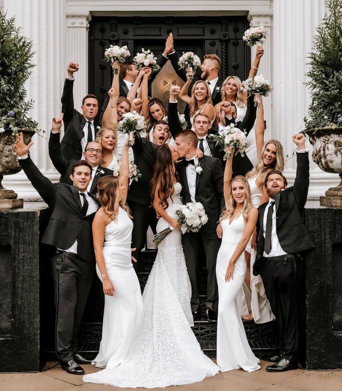
Black and white deliver high contrast and formality without needing much else.
The palette suits a couple who wants the wedding party attire to carry the color story, with black suits and white dresses reading sharp in photos and clear from a distance.
Keep florals white or greenery-based so they don’t compete with the graphic simplicity of the palette. The look works especially well in architectural venues where the structure already provides visual interest.
Gold or crystal accents add warmth if the space feels too stark, but the palette holds on its own.
12. Deep Orange Sunset Shades
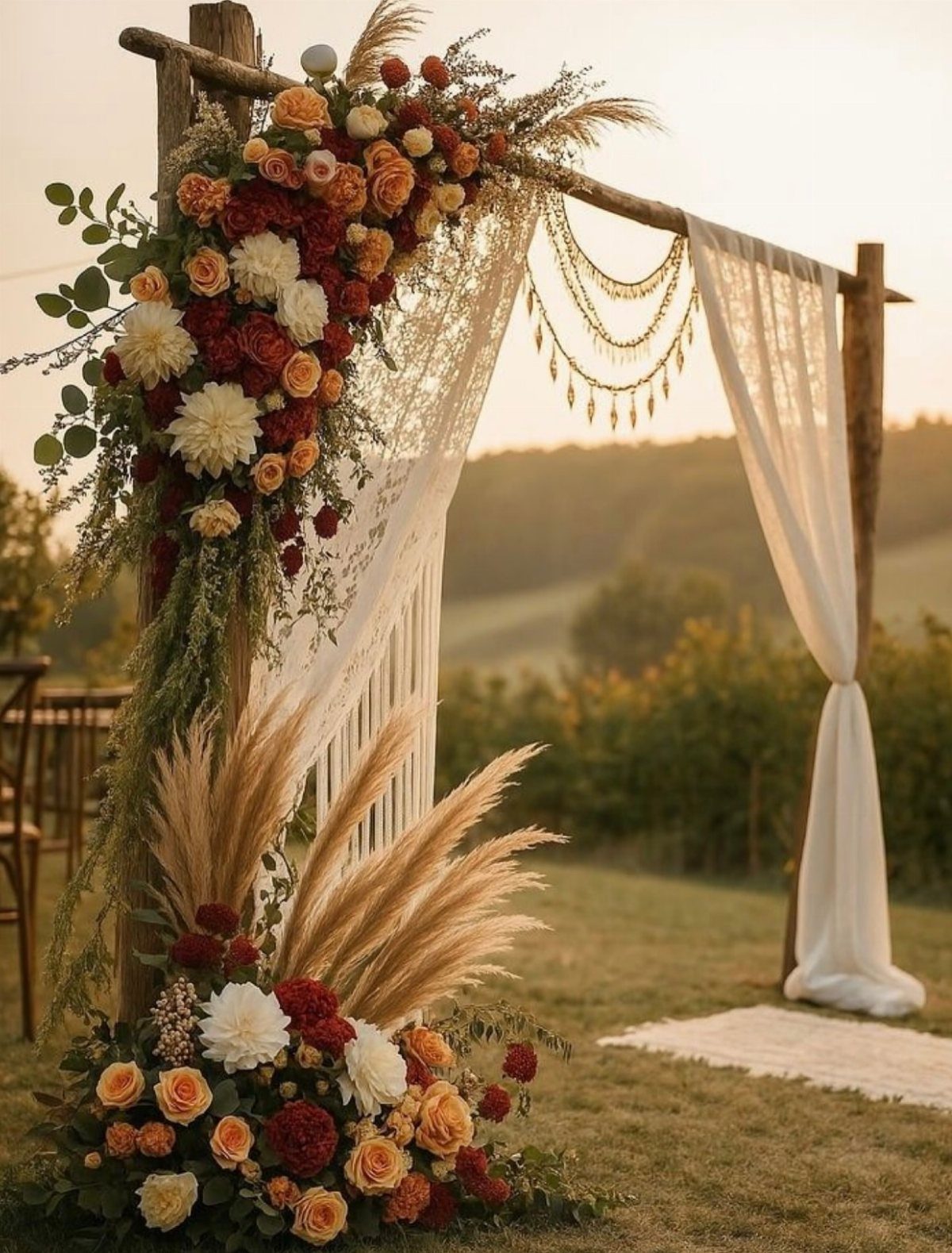
Deep orange pulls warmth from sunset tones and suits an outdoor ceremony where the natural light already leans golden.
The palette works best in late afternoon or early evening when the sky mirrors the florals and the whole setup feels intentional rather than staged.
Layer burnt orange, coral, and rust through roses or dahlias, and use pampas grass or dried grasses to add texture without cooling the palette.
Warm outdoor light brings out the depth in these tones, while cooler indoor fixtures can dull them, so check how your venue’s lighting reads before committing.
13. Funky Fuchsia
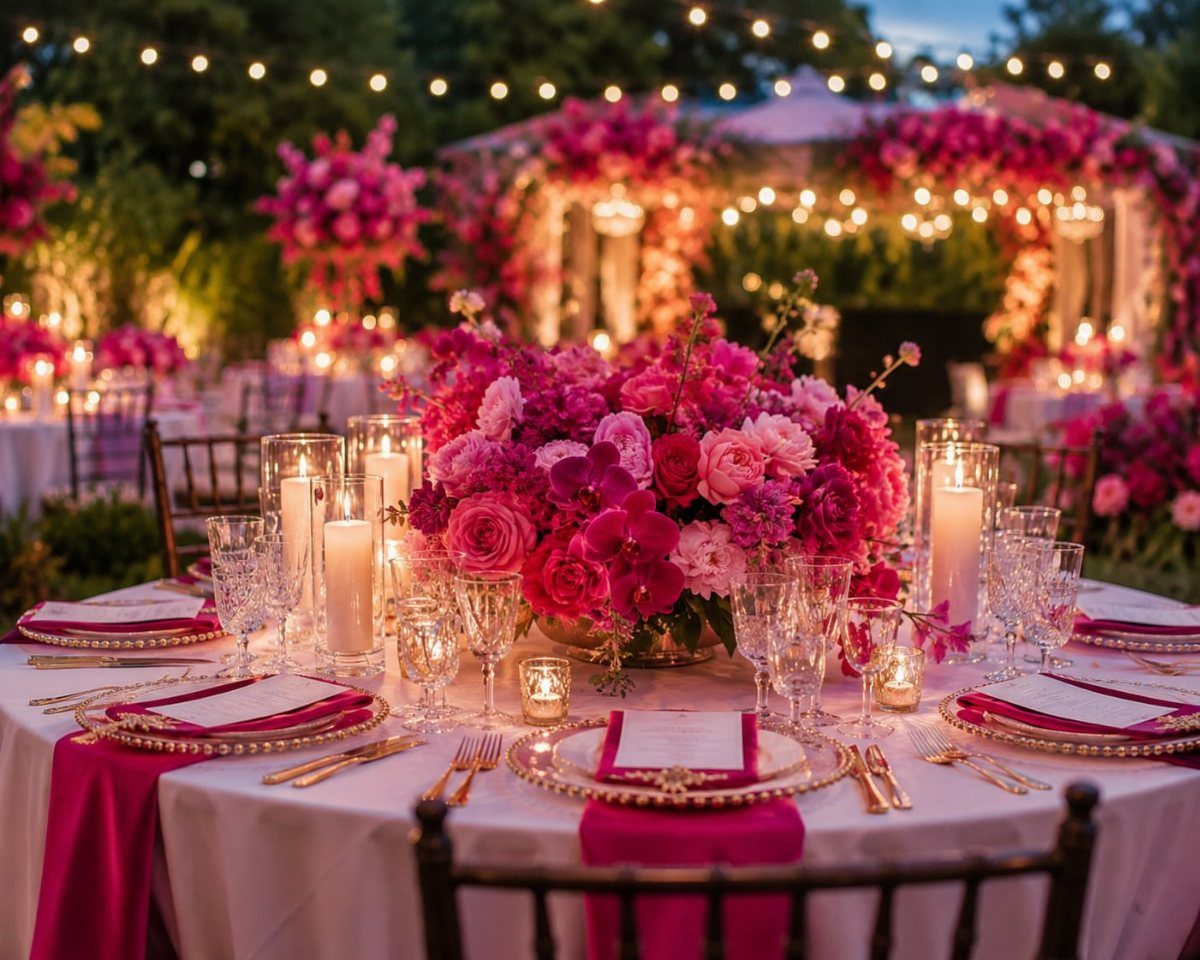
Fuchsia brings the boldness some couples want but most palettes skip. The hot pink reads playful and unapologetic, which suits a couple who wants their wedding to feel more like a party than a ceremony.
Keep the base neutral so the fuchsia stands out: white linens let the pink napkins and centerpiece carry the color without competition.
If fuchsia feels too intense, pull it back to one or two elements rather than diluting the shade.
Seasonal Color Considerations
Spring and summer weddings pull from what blooms in quantity: peonies, garden roses, and ranunculus come into season and drop in price between April and August, which makes blush, white, and soft pastels easier to source.
Fall tilts toward dahlias, burgundy, and burnt orange, while winter suits deeper tones like navy and evergreen that photograph well in low light.
Seasonal availability changes what you pay.
A peony centerpiece in June costs half what it does in December, and substituting out-of-season blooms for something similar rarely looks the same. If your palette depends on one flower, check when it’s in season before you set the date.
Screens shift color more than you expect. A dusty blue napkin that looks perfect on your monitor can arrive gray or purple depending on the dye lot, so order fabric and paper samples before committing to full quantities.
Using Color Palettes in Decor
Your palette should reach every printed piece and fabric surface if you want the setup to read cohesive. That means bridesmaid dresses, linens, napkins, invitations, candles, and signage all pull from the same 2 or 3 colors.
HEX codes help when you’re working with a planner or stationer who needs a digital reference, but they only get you close.
Fabric dye, printer ink, and screen calibration all shift tone, so request physical swatches for anything that touches the table or goes in a photo.
Start with the largest surfaces first: linens and bridesmaid dresses eat most of the budget and set the base color.
Once those lock in, layer the accent through smaller items like napkins, ribbons, or escort cards where swapping them out later won’t cost much.
Frequently Asked Questions
How do I choose wedding colors that work with my venue?
Look at what the venue already has: the floor, the walls, any permanent greenery, the wood tone. You can match those elements or play against them, but ignoring them means your setup will fight the room.
How many colors should a wedding color palette have?
Two or three colors cover most weddings: a main, an accent, and maybe a neutral, without looking like you color-coded everything.
More than that and the setup starts to lose focus, especially when you’re layering the palette across linens, florals, and printed pieces that all need to read cohesive.
Can I share HEX codes with my wedding vendors?
HEX codes give your planner or stationer a starting point, but they’re only approximate.