Script lettering brings ceremony to the page, and a sturdy serif or sans holds the details readers need to scan.
A font that reads clearly on a white card under studio lighting can disappear on colored stock or in dim reception light, so print a test at full size in the actual conditions before you commit to the full order.
1. Pinyon Script + Forum
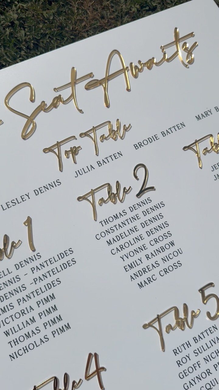
Pinyon Script is a Google font with thin, looping letterforms that pair cleanly with Forum, a straight serif that holds up under script without adding decoration of its own.
The contrast between the 2 keeps names readable while the script supplies the formality you want on a seating chart or program.
Both are free to download and install, so you can set up your layout in Canva or Word without paying for a font license.
2. Rustic Wedding Font
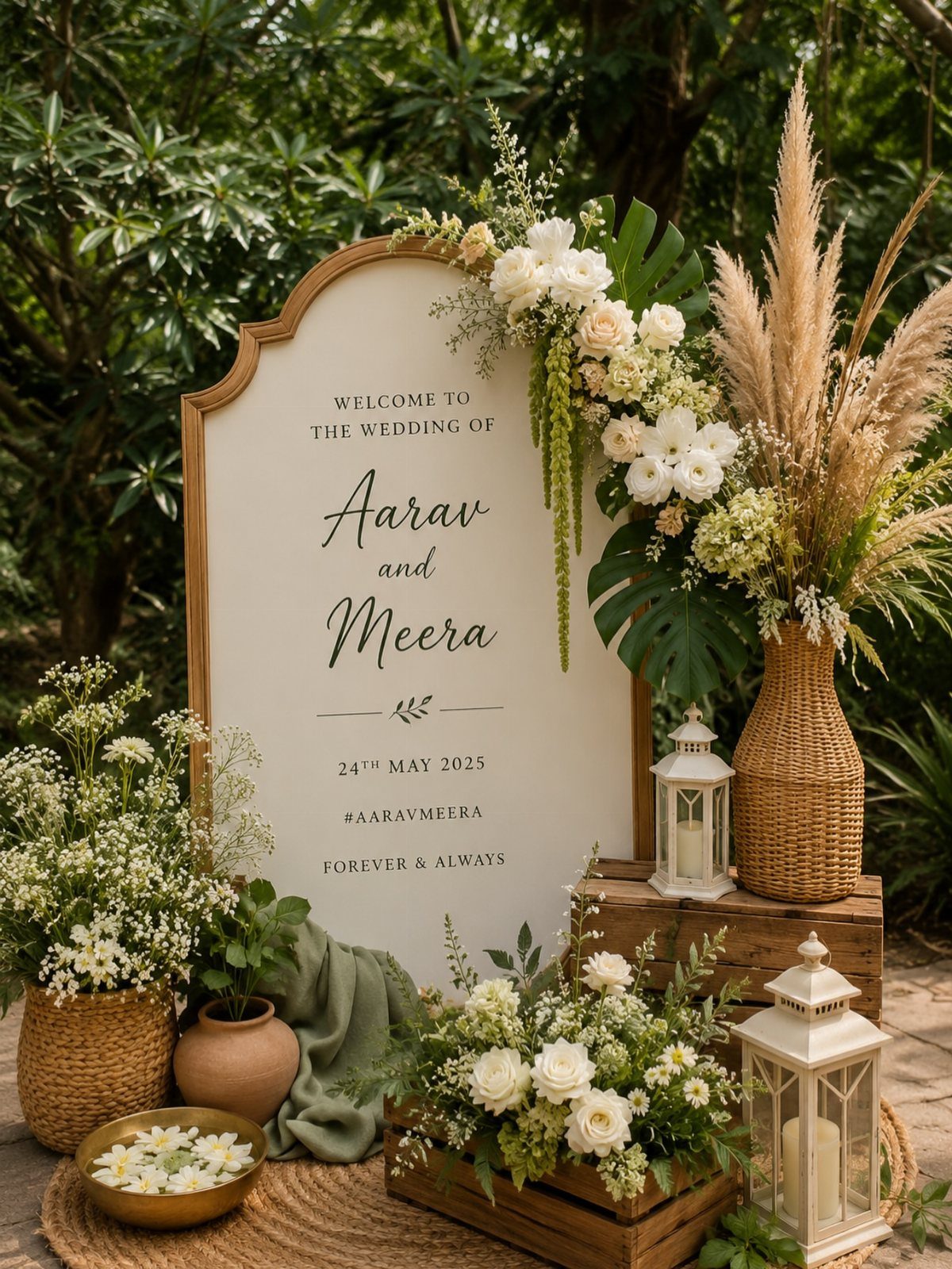
Rustic Wedding is a handwritten script with visible texture in the strokes, giving the impression of pen and ink without commissioning custom calligraphy.
The lowercase letters connect naturally, and the capitals carry a bit more flourish, so names and headings get emphasis while longer text stays easy to read.
The font includes multilingual support, which matters if you have guests whose names use accented characters. You can use it for welcome signs, menus, and place cards while keeping a consistent look across all your printed stationery.
3. Spencerian Script Calligraphy
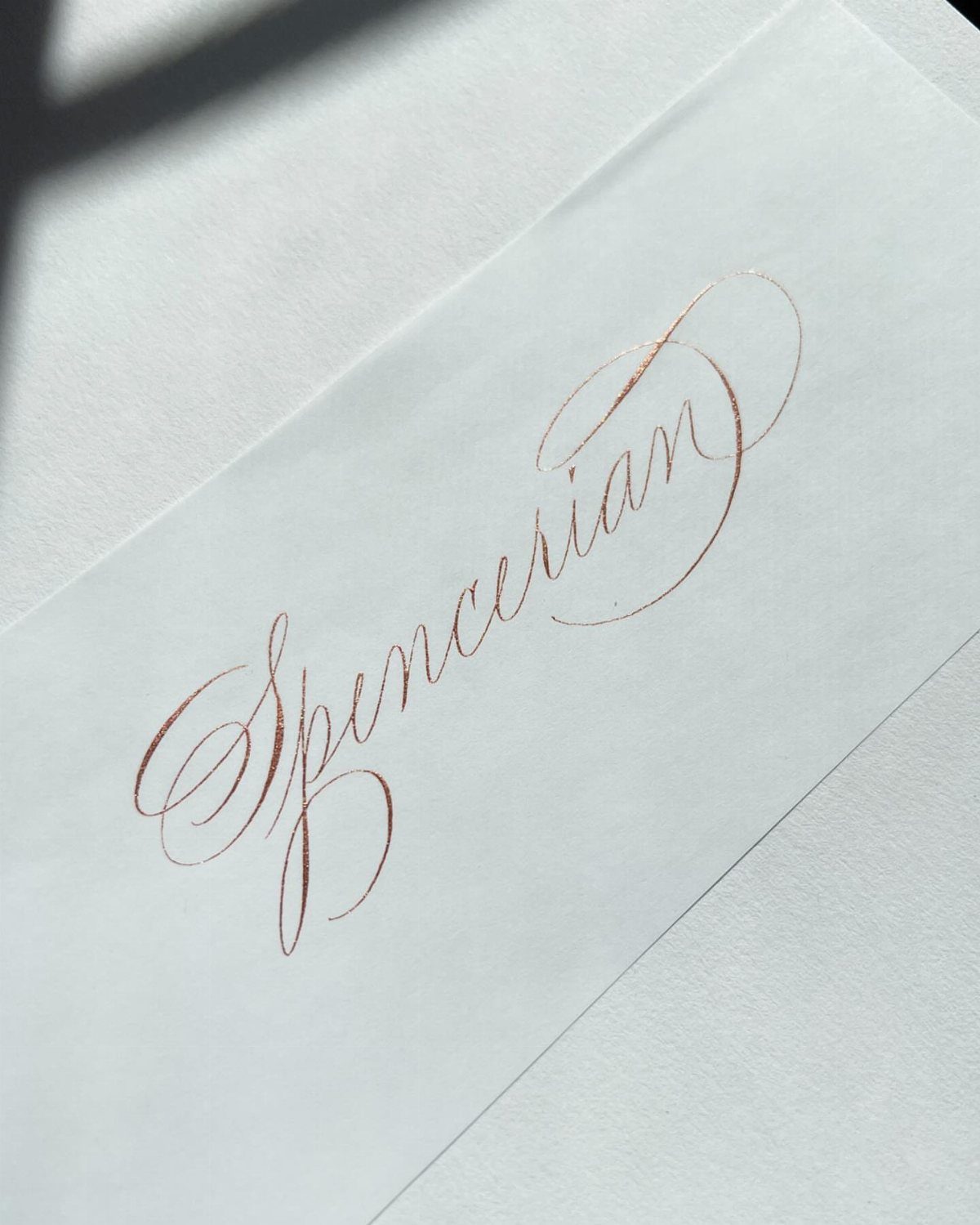
Spencerian calligraphy is a 19th-century script with thin hairlines and thick downstrokes, traditionally written with a pointed pen and ink.
The style relies on consistent pressure and angle, so the letters have that classic copper-plate elegance seen on formal invitations and envelopes.
To get this look, hire a calligrapher trained in Spencerian or use a digital font modeled on it.
4. Curved Heart Calligraphy
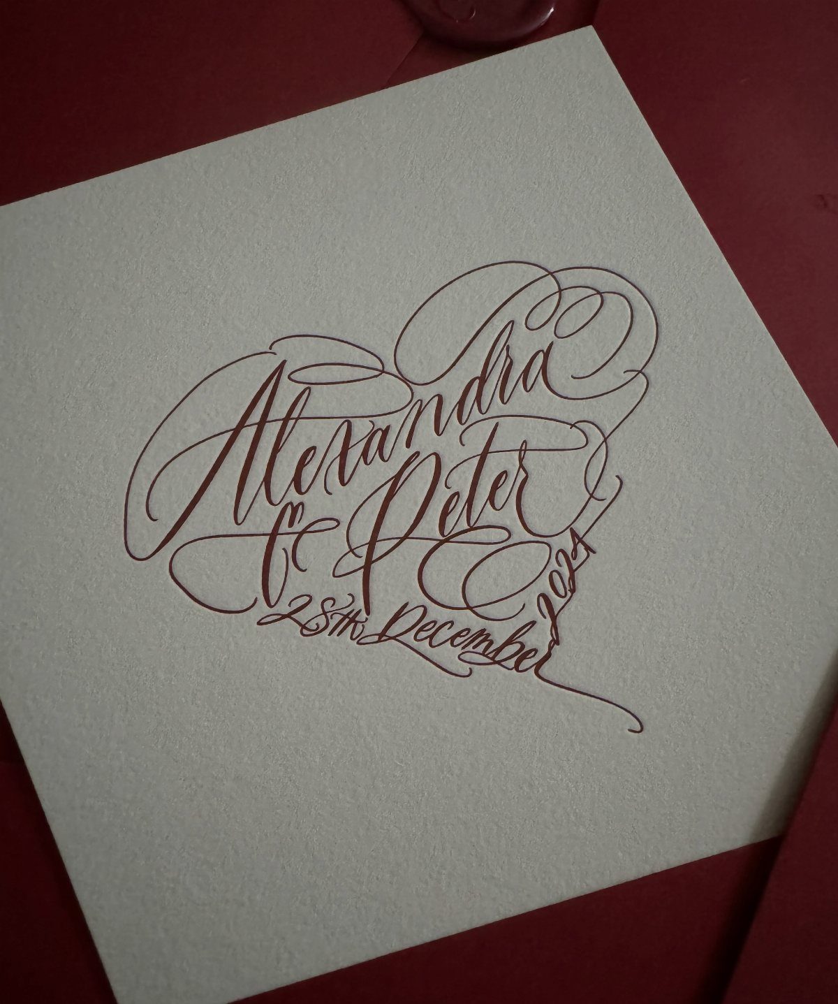
This layout arranges the names and date in a heart outline using red calligraphy on a white card. The script curves to follow the shape, so the text becomes the decoration rather than sitting beside it.
You can hand this to a calligrapher as a layout request, or attempt it yourself if you have pointed-pen experience and a steady hand.
Red ink photographs boldly and suits a Valentine’s Day or winter wedding. The card itself is plain, so the entire focus stays on the lettering.
5. Flourished Black Script Invitation
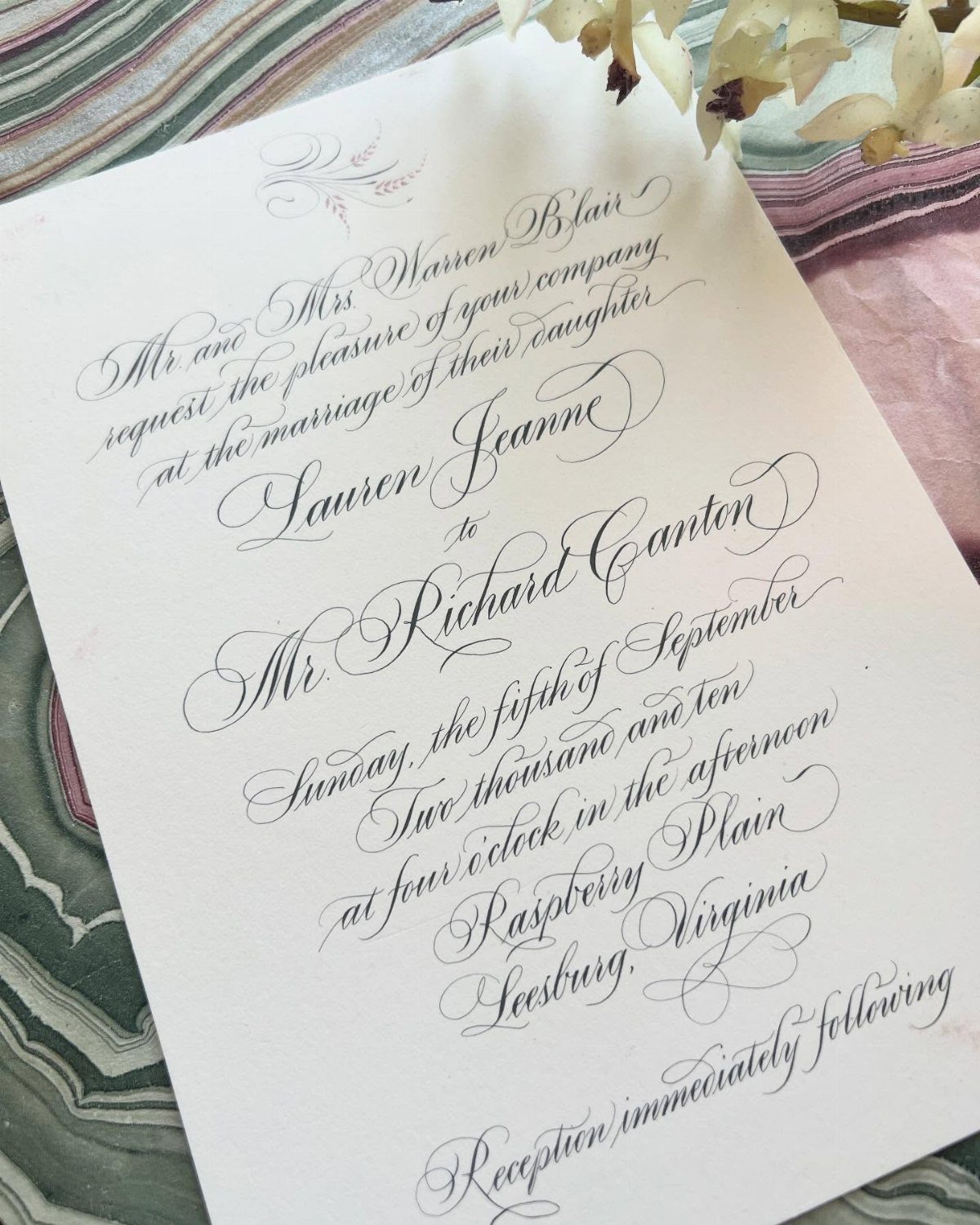
The script is formal but not minimal, so the invitation feels grand without adding color or pattern.
Black ink on white paper is the most traditional combination and works with any wedding palette.
For this level of flourish, look for a calligrapher whose portfolio shows decorative capitals and confident loops. The style suits a ballroom or estate venue better than a casual outdoor celebration.
6. Navy Envelope Script
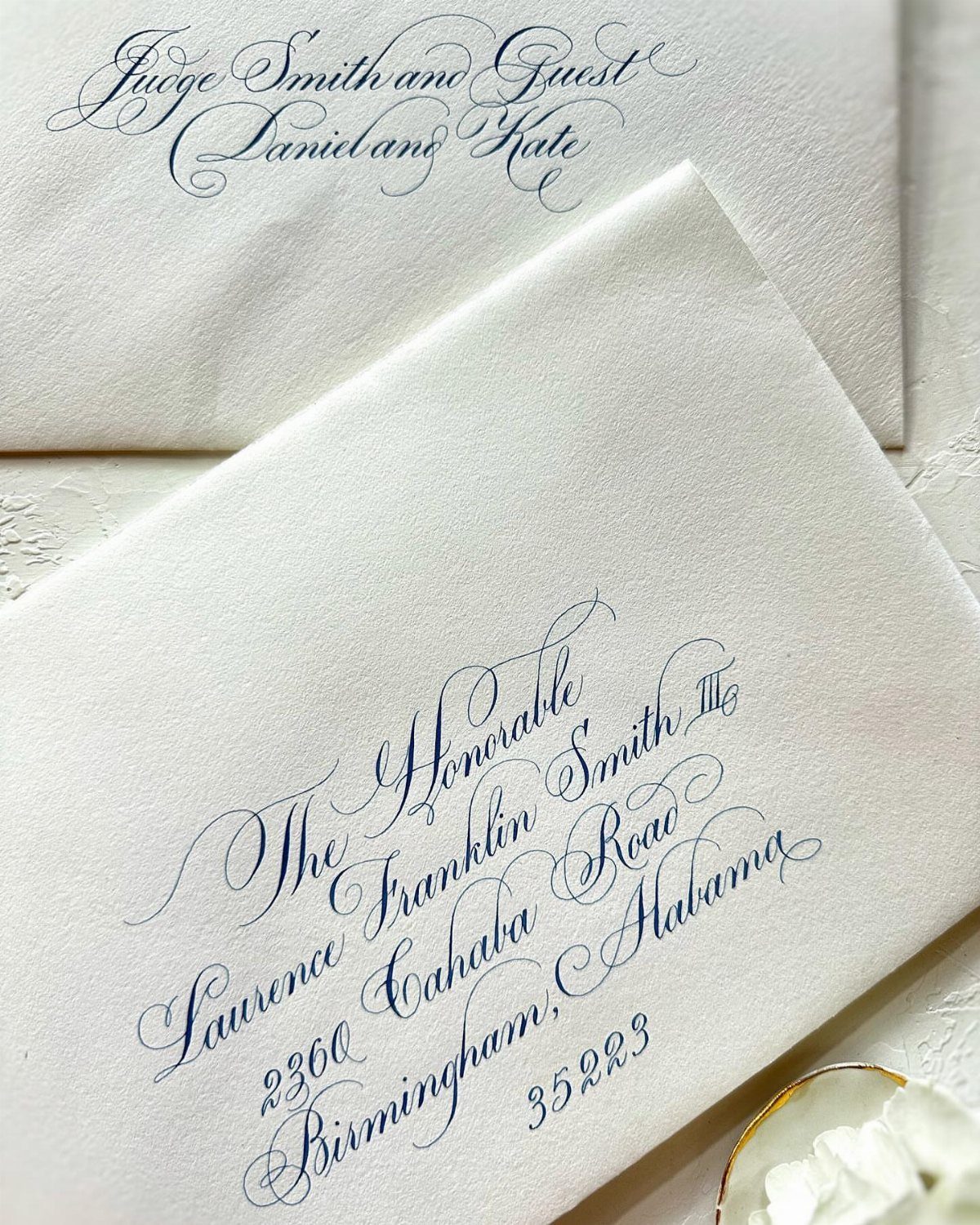
Addressing envelopes in navy script gives you the polish of calligraphy without the stark formality of black.
The color reads as elegant but slightly softer, and it pairs well with navy wax seals or liner paper to carry the shade through the envelope design.
You can hire a calligrapher to hand-letter each address, or use a digital calligraphy service that prints directly onto your envelopes. Navy ink works on white or ivory stock and holds up well in photos.
7. Dark Brown Place Card Script
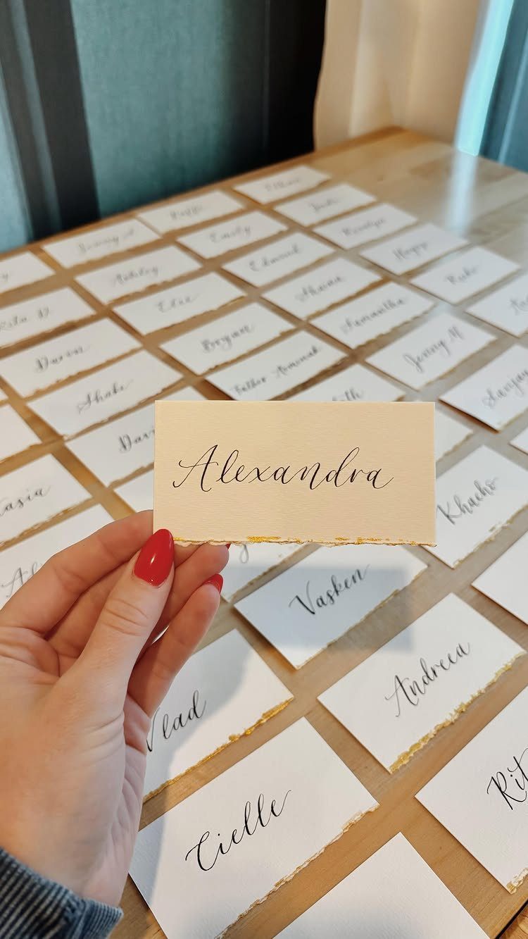
Brown ink softens the formality of place cards without losing the elegance you want on the table. The warm tone pairs well with neutral linens, wood tables, and fall or earth-toned palettes.
Deckle edges add texture and a handmade feel.
You can tear them yourself with a ruler and water along the card’s edge, or order pre-cut cards from a stationery supplier. Either way, the uneven border makes each card feel a bit more intentional than a straight-cut rectangle.
Hand-lettering each name takes time, so budget for a calligrapher if your guest count runs above 50.
8. White Script on Emerald Green
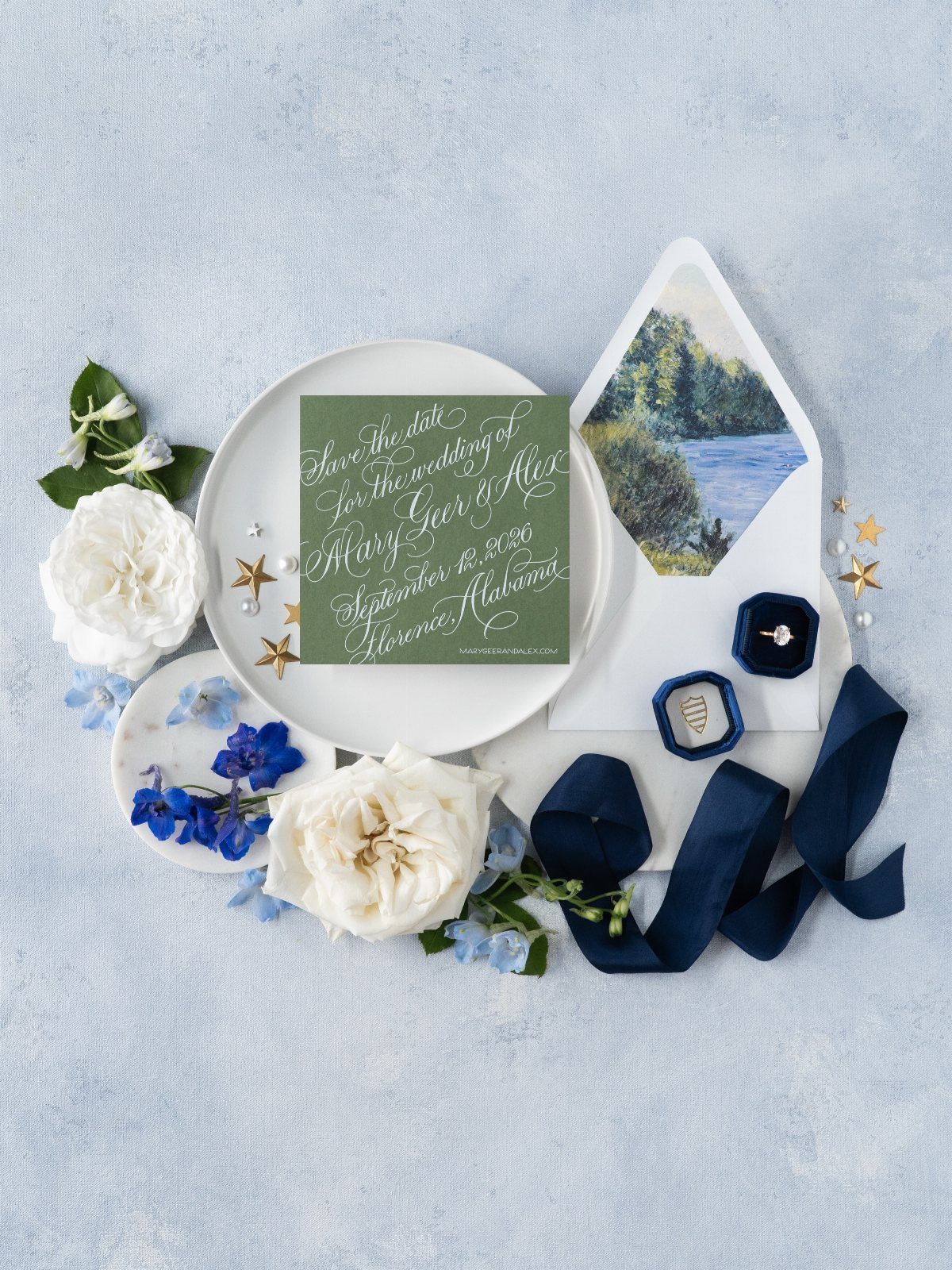
White ink on a saturated background reverses the usual contrast and makes the lettering feel lighter.
The emerald green works for a jewel-toned palette or a winter wedding, and the script stays readable because the paper color does the drama instead of the flourish.
To get opaque white on dark stock, you need either foil stamping or a calligrapher working with gouache or gel ink.
Standard printing usually produces gray rather than true white, so ask your printer what their white ink looks like on colored paper before committing to the full order.
9. Romantic Red Script and Serif
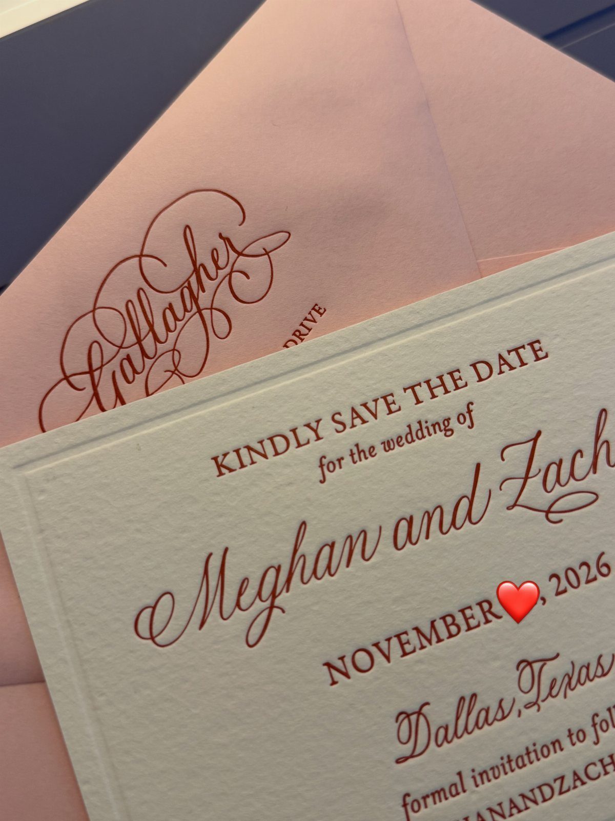
Red script and serif together let you emphasize the names while keeping the date and location easy to scan.
The combination works on a save-the-date because you only need a few lines of information, and the color holds attention without a patterned background or border.
If your invitation suite uses a different palette, you can print the save-the-date in a contrasting color and bring your main shades in later on the invitation itself.
10. Menu Script and Serif Combo
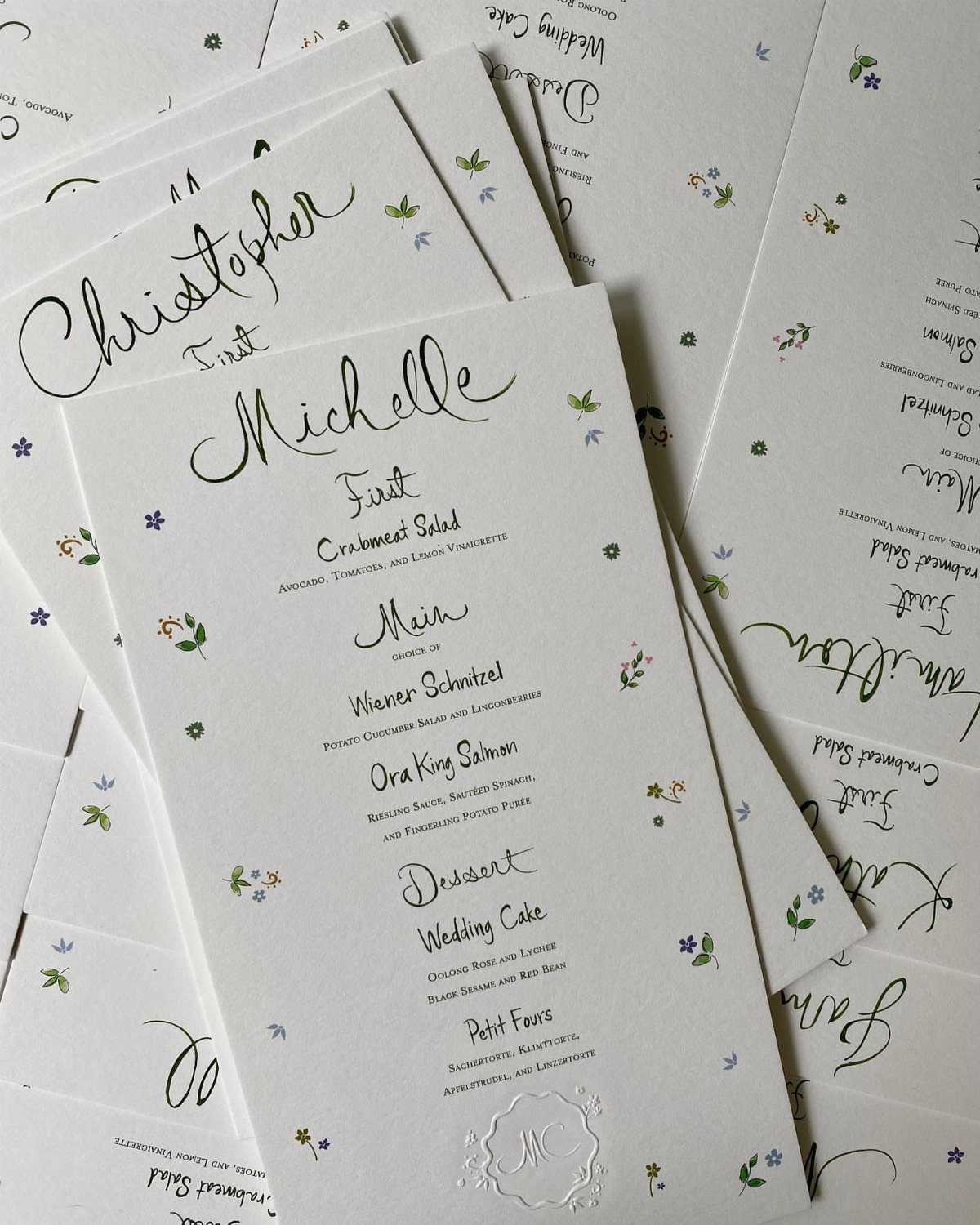
A menu card needs two voices: one for the course names and another for the descriptions. Script handles the headings while serif keeps the longer text legible, so guests can skim the card quickly at their seat.
Black on white is easy to print at home or through an online stationer, and it works with any table setting. If you are printing these yourself, size the serif text large enough that guests can read it by candlelight.
11. White Script on Burgundy Paper
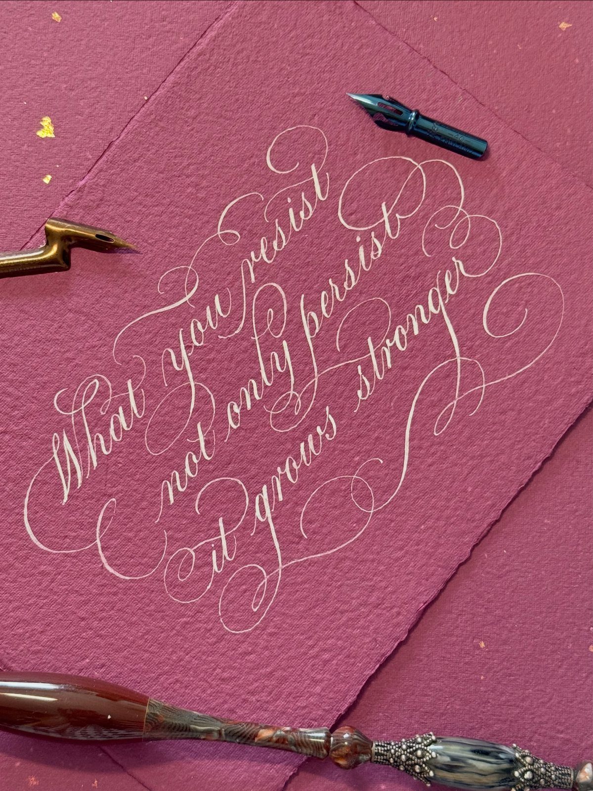
Burgundy paper gives you a rich backdrop that does not need florals or borders to feel finished. White calligraphy stands out cleanly, and the ornate loops photograph well because the contrast is high.
Textured paper adds dimension but can be harder to letter on if the surface is too fibrous.
Look for cotton or linen-finish cardstock with a smooth top layer. If you are hiring a calligrapher, send them a sample sheet first so they can test ink flow before addressing the full batch.
12. Gold Script on Light Blue
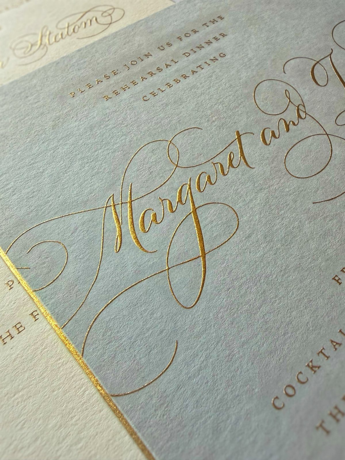
Gold foil on pastel stock feels formal but not heavy, and the light blue reads softer than navy or ivory would.
Foil stamping requires a custom die and a minimum order, so it makes sense when you want the metallic finish on multiple items in your suite.
If gold foil pushes your budget too high, gold ink or a metallic pen can mimic the look at a lower cost, though the shine will not be as reflective.
13. White Calligraphy on Pink Envelopes
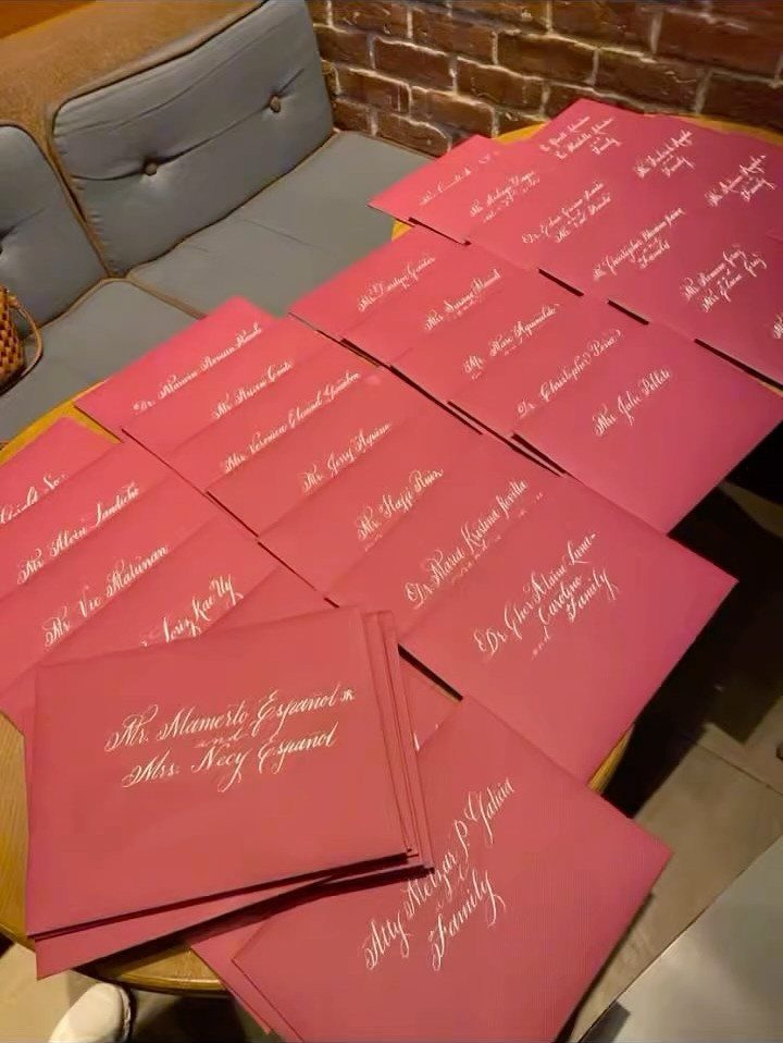
Pink envelopes with white calligraphy soften the look of a formal invitation suite without losing the polish. The pastel stock gives you color without pattern, and white ink shows up clearly because the pink is light enough to read against.
White gouache or gel ink works better than foil for this combination, since foil can crack on textured paper.
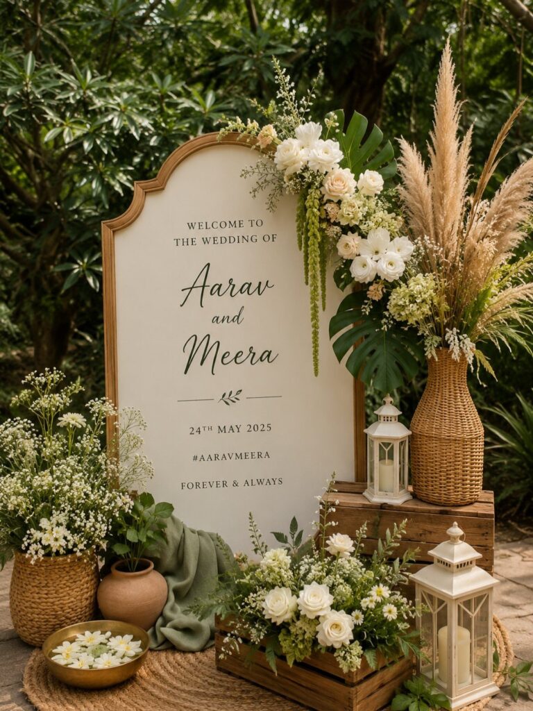
14. Arched Sign Script and Serif
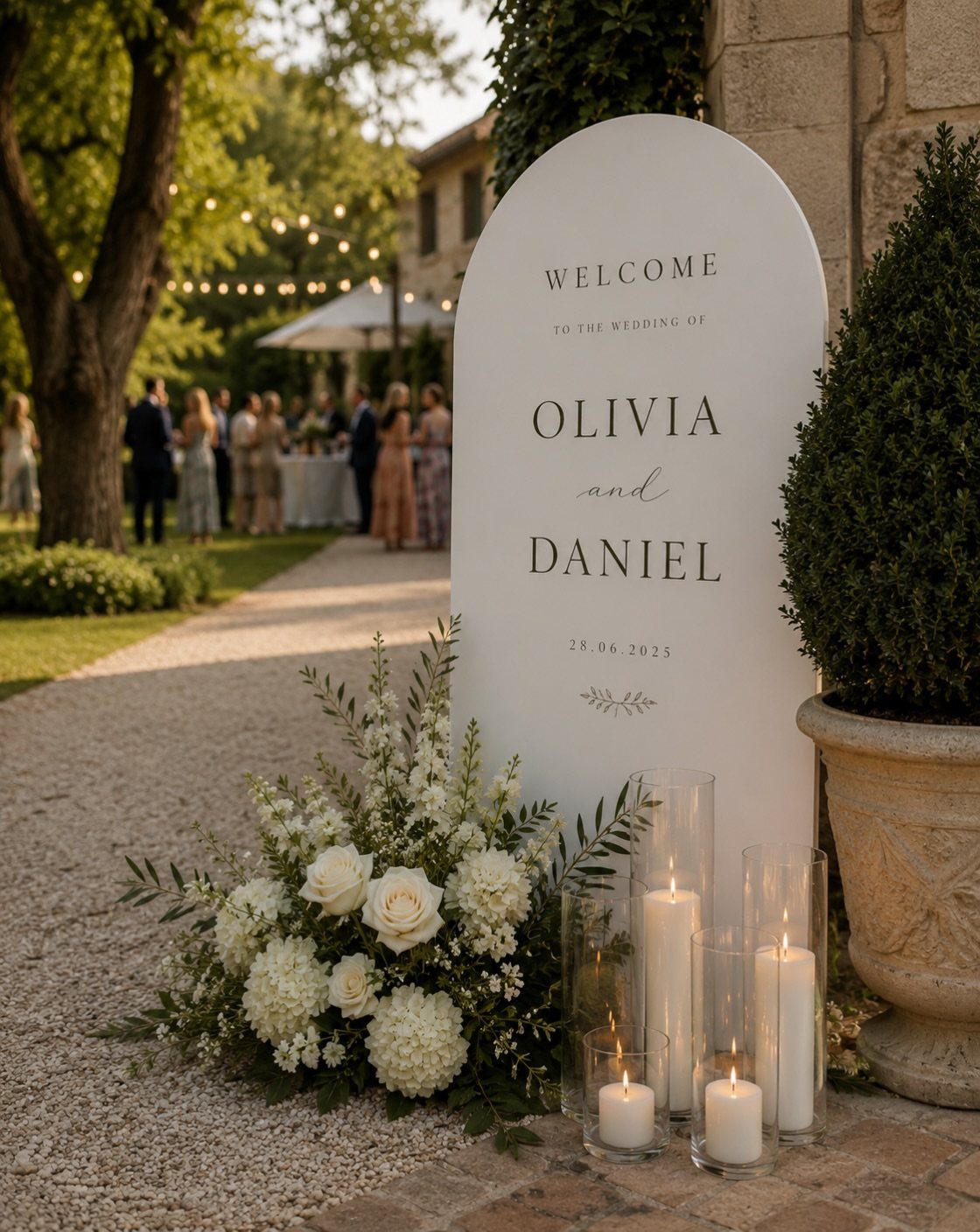
An arched sign fits a ceremony entrance or welcome table and gives you room to mix typefaces without crowding the layout.
Bold serif handles the names while script carries the date and location, so the hierarchy is clear from several feet away.
White acrylic or painted wood holds up outdoors and photographs well against greenery or a neutral backdrop.
You can order a custom sign through a stationer or paint one yourself if you have steady lettering skills. Size it large enough that guests can read it from a few steps back while walking.
15. Gold Wax Seal Monogram
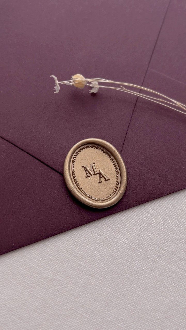
A wax seal closes the envelope with texture and weight that printing cannot match. Gold wax on deep purple gives you a jewel-toned finish, and a serif monogram keeps the seal formal without heavy flourish.
Buy a custom brass stamp with your initials from a stationer or online supplier.
Melt the wax with a spoon over a candle, pour it directly onto the envelope flap, and press the stamp firmly until it sets. Let each seal cool completely before stacking the envelopes, or the wax will stick.
Choosing the Right Font
Start with your wedding theme and work backward. A ballroom reception calls for different typefaces than a barn or garden ceremony, and the font should reinforce the setting rather than fight it.
Legibility matters more than decoration. A script that looks beautiful on a mood board can turn unreadable at place-card size or under candlelight.
Test your choices on paper at actual size before ordering the full print run, and check them in the lighting conditions your guests will see them in.
Emotional tone shifts with stroke weight and spacing. Thin, looping scripts feel formal and traditional.
Bold serifs read confident and grounded. If the feeling is wrong, the font is wrong, even if it technically matches your color palette.
Print a sample invitation and prop it up across the room. If you have to squint to read the details, go simpler.
Tips for Pairing Wedding Fonts
Pair one voice that commands attention with another that steps back.
Contrast in weight and style creates hierarchy without adding color or pattern. A delicate script next to a sturdy serif tells the reader which text matters most, and the pairing feels intentional rather than accidental.
Avoid pairing two scripts or two decorative fonts.
Both compete for attention, and neither does its job. The simpler font is not filler; it holds the structure so the decorative one can do what it does best.
Print a sample invitation and check how the pairing reads on paper, not just your laptop. A combination that looks balanced on your laptop can feel cramped or jumbled on cardstock.
Resources for Finding Fonts
Google Fonts offers over 1,000 open-source typefaces you can download and use without a license fee. Filter by style or weight to narrow the options, then install the files directly into Word or whatever layout tool you are using.
Canva provides templates and a built-in font library, so you can design invitations and place cards in one place. A Pro account lets you bring in your own typefaces and use them on every piece you design.
Adobe Fonts comes with a Creative Cloud subscription and includes professionally designed typefaces that are harder to find elsewhere.
DaFont hosts over 34,000 fonts sorted by category, and WhatTheFont identifies a typeface from a photo if you find one you like but do not know its name.