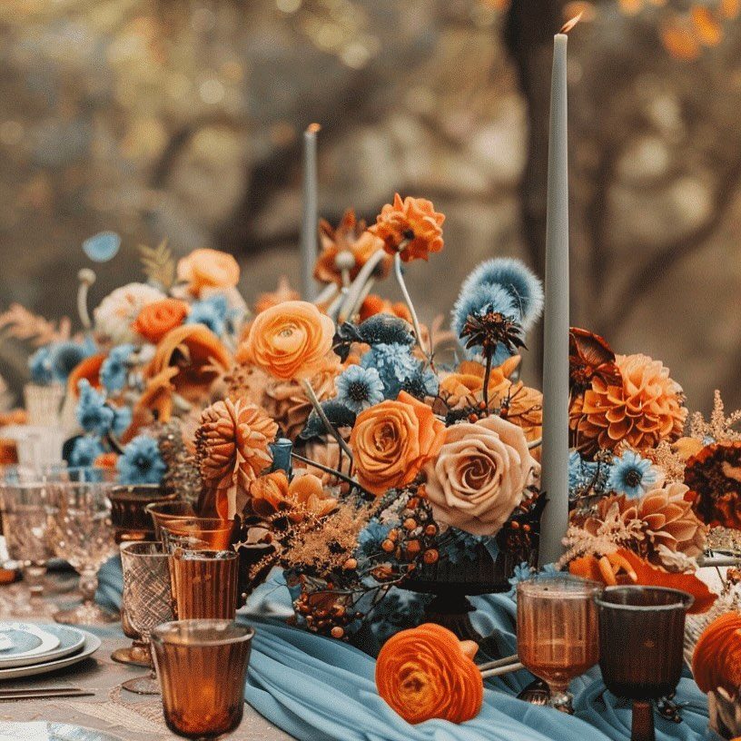
Fall wedding palettes range from the soft neutrality of sage green and white to the dramatic richness of deep teal paired with red, with navy, dusty rose, terracotta, burgundy, and deep purple filling the spectrum between.
Your venue’s existing texture decides how warm or cool you should go: brick, wood, or stone interiors support burgundy, terracotta, and mocha brown, while ballrooms with high ceilings carry the weight of deep purple velvet or draped teal fabric.
1. Navy Blue
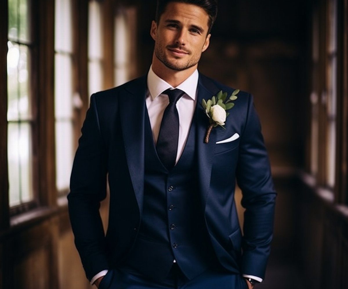
Navy blue brings a refined, formal look that fits seamlessly into fall without leaning too heavily on autumn’s typical warm palette. The depth of the color grounds the ceremony while still feeling seasonal.
Grooms and groomsmen can anchor the look with navy suits, and bridesmaids can carry it through with navy dresses in chiffon or velvet. White florals stand out beautifully against it, keeping the overall feel crisp rather than heavy.
Navy gives you polish without announcing fall too loudly.
2. Dusty Rose
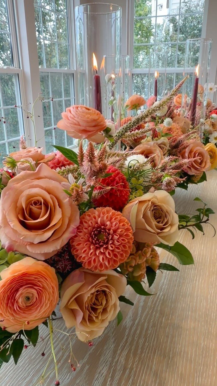
Dusty rose softens the typical fall palette with a muted, romantic tone that still feels right for the season. The combination here pairs it with deeper burgundy accents in the candles, which keeps the softness from reading too spring-like.
Roses and dahlias in dusty rose and peach tones give centerpieces texture and volume without needing a lot of filler. Taper candles in burgundy or deep plum add vertical interest and tie the softer florals back into fall.
This lands rustic and feminine but stops before it turns too sweet.
3. Terracotta and Dusty Yellow
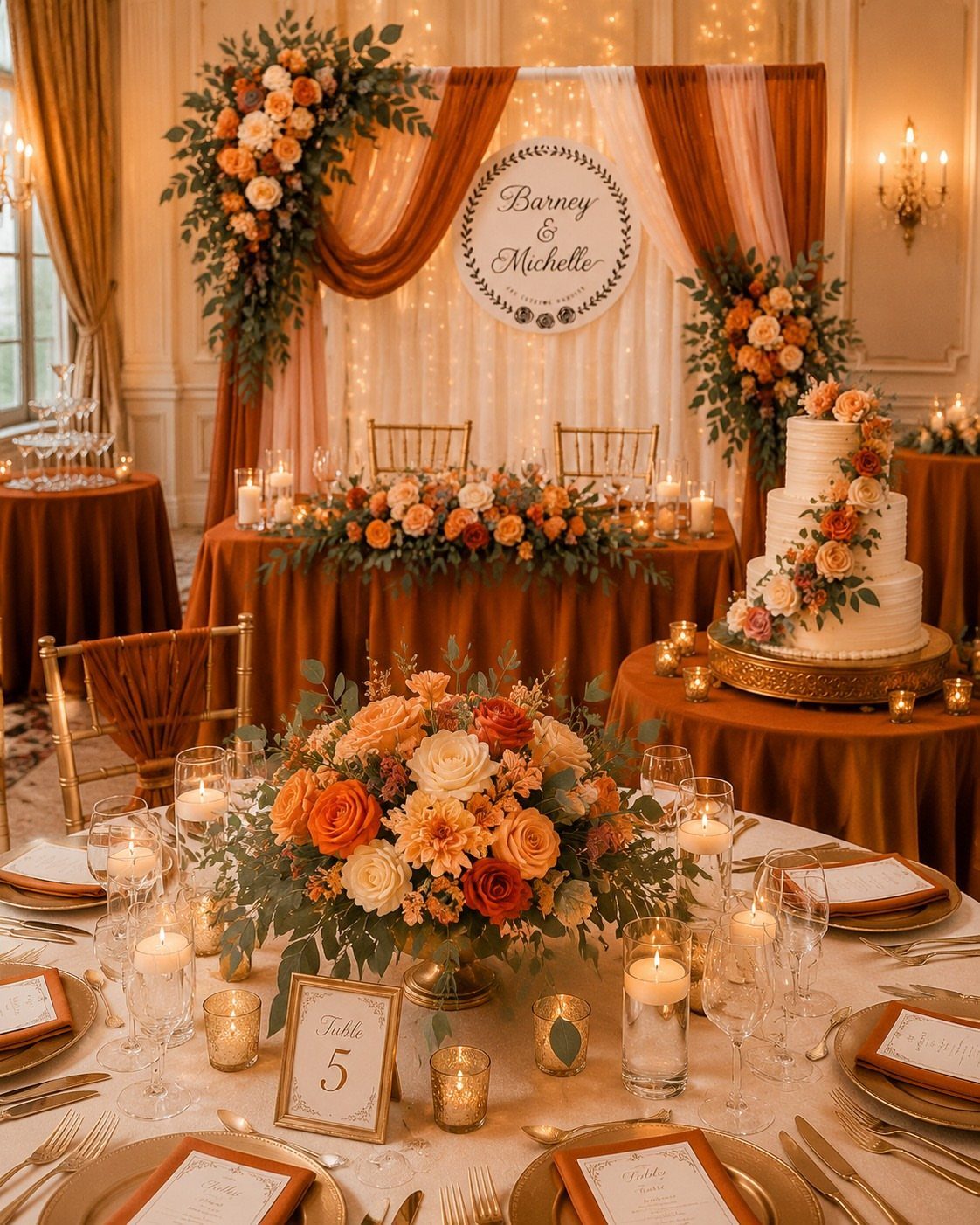
Terracotta and dusty yellow bring warmth to fall tables without relying on the usual deep reds and oranges. The combination feels earthy and approachable, and the lighter yellow keeps it from getting too heavy.
Terracotta linens anchor the tables, and arrangements with orange and cream florals in varied heights add dimension. Gold chairs and signage pull the warmer tones together and give the setup a polished finish.
If your venue has natural wood or neutral walls, this palette complements it without competing. The warmth reads as inviting rather than formal.
4. Black and White
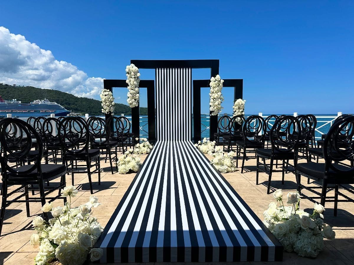
Black and white stripes give a bold, graphic look that feels intentional and modern. The high contrast stands out, especially outdoors where the natural surroundings provide softer color.
The rest of the setting needs to stay simple so the pattern holds focus.
This suits couples who want something striking and less traditional. The formality comes from the palette itself, not from ornate details.
5. Burgundy, Ivory, and Gold
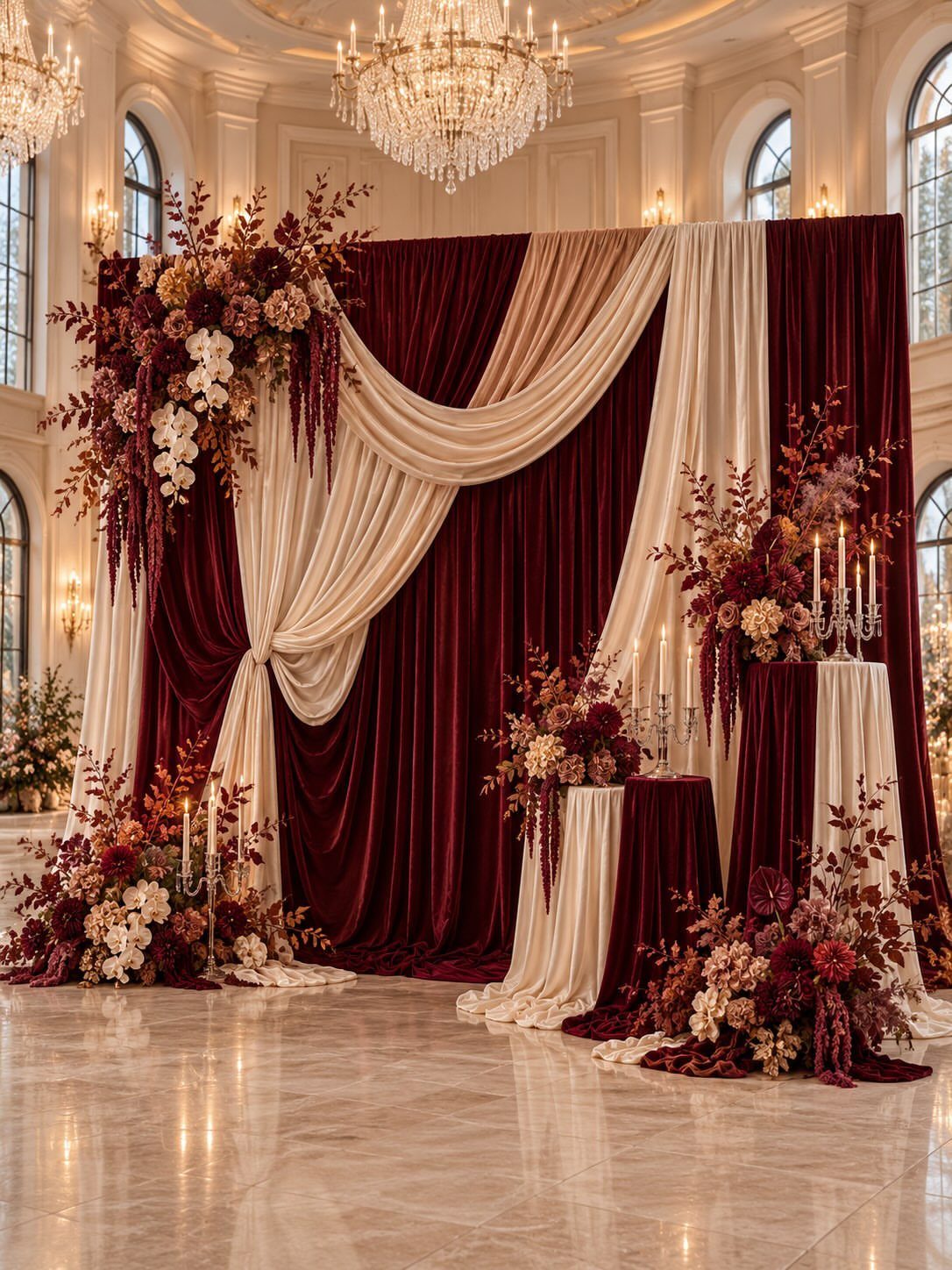
Burgundy velvet layered with ivory fabric and accented with gold creates a rich, luxurious backdrop that feels both autumnal and formal. The velvet texture adds depth, and the draping softens the structure of the space.
Gold candlesticks and chandeliers amplify the opulence, and autumn florals in deep reds, oranges, and browns bring seasonal color while the palette stays grounded. Ivory balances the heavier burgundy and stops things from feeling too dark.
This works for ballroom or indoor venues where you have the ceiling height and space to support dramatic draping and large-scale arrangements.
Deep colors, like a rich plum and beautiful burgundy, are bound to warm up any crisp fall evening.
6. Peach and Green
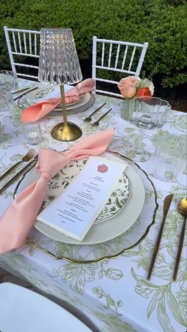
Peach and green offer a softer alternative to the deeper fall tones, and the combination still works for autumn when the green leans toward olive or sage.
The green leaf-patterned tablecloth here grounds the look in nature without feeling too summery.
Peach napkins in linen or cotton add warmth, and white plates keep the place settings clean. Gold flatware ties the peach tones together and adds a touch of formality.
This palette suits outdoor receptions, especially garden or vineyard settings where the greenery around you complements the table design.
7. Fall Oranges
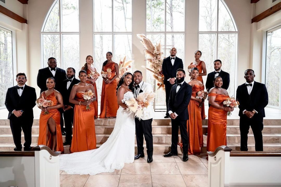
Burnt orange dresses on the bridesmaids give a bold, saturated take on fall color that feels celebratory rather than understated. The black tuxedos keep the formality high, and the contrast between the orange and the black sharpens the overall look.
For fall to show up clearly in your wedding party attire, this does it without needing to layer in multiple accent colors. The orange carries the palette on its own.
8. Deep Purple and Lavender
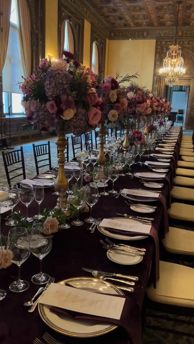
Deep purple as the base color gives this setup weight and drama, and the lavender and pink florals in gold vases soften it without losing the richness.
The layering of purple tones keeps the palette cohesive while the lighter florals add dimension.
White plates and glassware keep the place settings from feeling too heavy, and the ornate room architecture supports the formality of the color choice.
This suits ballroom or historic venues where the space can match the richness of the palette.
9. Deep Teal and Red
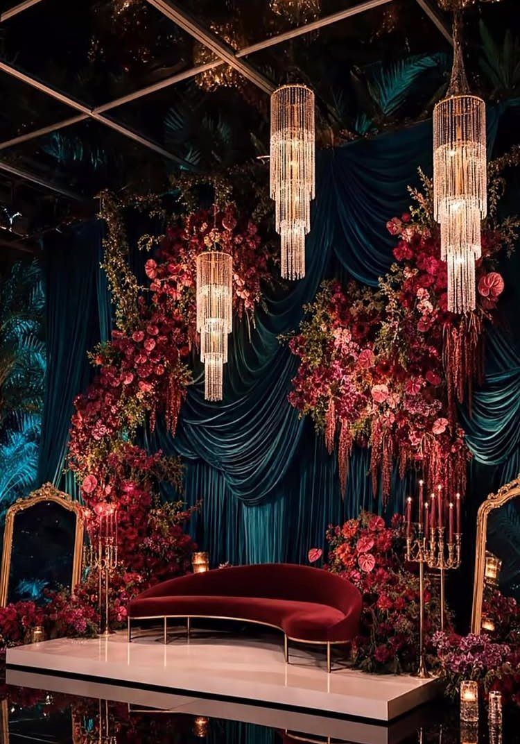
The deep teal draping creates a bold backdrop, and the cascading red and pink florals bring volume and movement without needing much structure. Crystal chandeliers add formality and reflect light into the darker teal fabric.
The red velvet sofa anchors the lounge as a statement piece, and the white platform lifts it visually so it holds its own against the draping.
This works for receptions where you want a defined lounge area that feels separate from the dining tables.
10. Mocha Brown and Tan
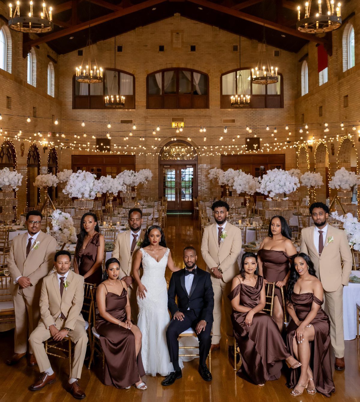
Mocha brown dresses and tan suits give the wedding party a warm, coordinated look that feels grounded in fall tones without pushing into the deeper burgundy or orange ranges.
The lighter tan suits keep the palette from feeling too heavy, and the mocha brown ties it back to autumn.
Black on the groom creates contrast and separates him visually from the groomsmen, which is standard formal structure.
This palette suits indoor venues with warm lighting or brick and wood interiors that echo the brown and tan tones.
11. Sage Green and White
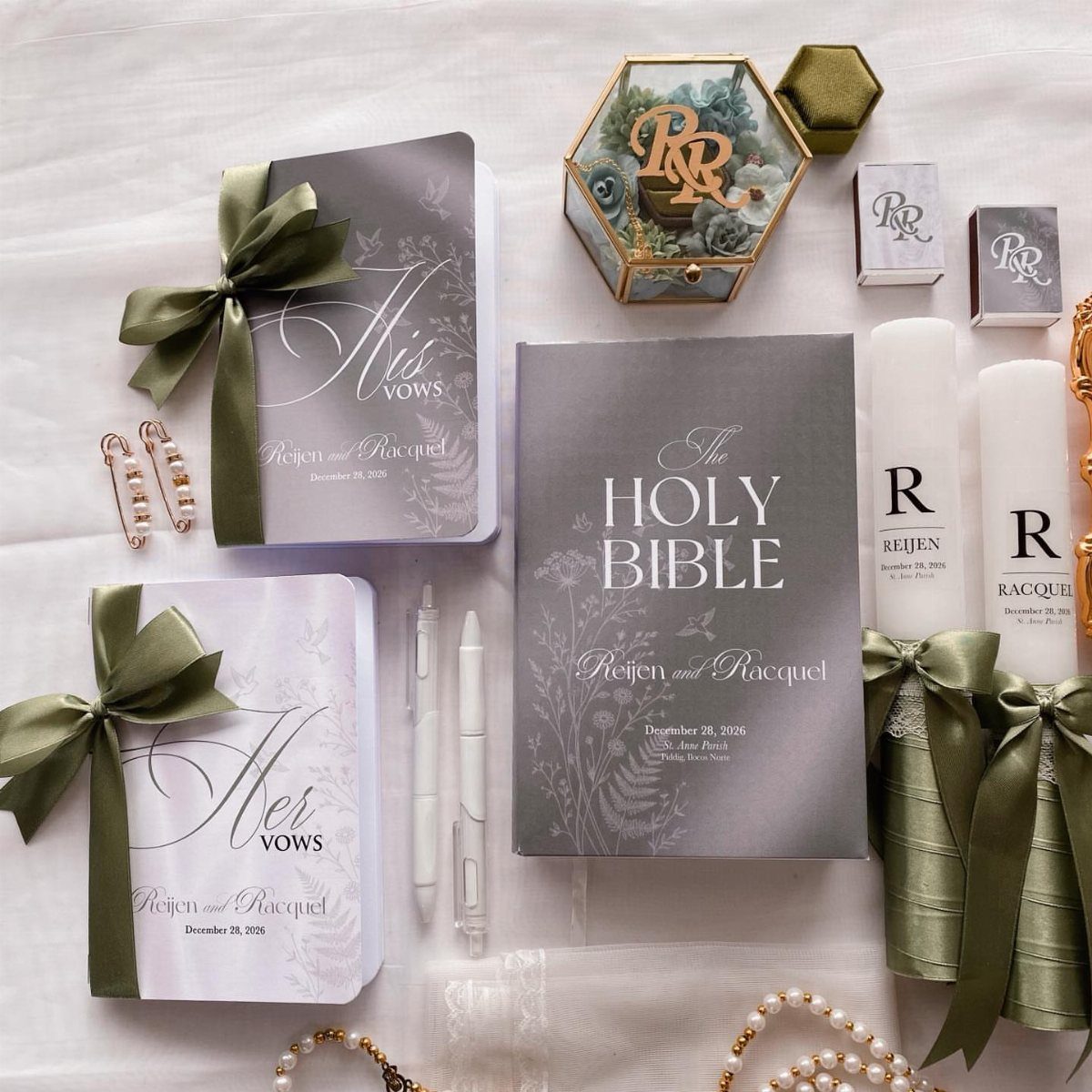
Sage green ribbon and vow books paired with white fabric and candles create a soft, neutral palette that still feels intentional. The green ties the look to fall without leaning into the warmer oranges and reds.
This works for couples who want a quieter color scheme that complements rather than dominates the ceremony details. The sage green accents show up in small items like ribbons, vow books, and table runners, so the palette stays subtle.
White keeps the overall look clean and lets the green accent the design rather than fill it.
Choosing Your Fall Wedding Colors
Start with what grows in fall and what your venue already gives you.
Dahlias, mums, and ranunculus are in season and priced accordingly, and if your ceremony site has brick, wood, or stone, let that texture guide whether you lean warm or cool.
Narrow to 3 colors: one main, one accent, one neutral.
Burgundy, rust, emerald, and gold pair well with blush, ivory, silver, or black. More than that and the palette competes with itself.
Pick your dress shade early.
Your dress anchors every frame, so bridesmaid gowns need to complement its tone. If you are wearing ivory, that influences whether your florals skew warmer or cooler.
In-season flowers and a venue that supports your palette keep costs down and the look cohesive.
Incorporating Textures
The fabric you choose changes the way a color looks. Emerald velvet reads heavy and rich, emerald satin catches light and feels brighter.
Velvet adds warmth and works outdoors when temperatures drop. Chiffon moves and breathes, keeping darker colors from feeling too heavy.
Satin reflects light and suits formal receptions. Stretch crepe fits close and allows full movement, which matters for bridesmaids who plan to dance.
Metallic accents warm cooler hues. Copper and antique gold flatware, candlesticks, or chair frames pull warmth into navy, teal, or sage green palettes without adding another color.
Texture gives your palette depth that flat fabric cannot.
Balancing Colors
Pair a bold or moody shade with cream, taupe, or soft ivory to keep the palette approachable.
Carry them into menus, escort cards, favor packaging, and signature drinks. A cocktail napkin in your accent color or a drink garnish that matches your florals ties the design together without adding cost.
Fabric and finish make the same color feel more expensive. Velvet napkins, silk ribbon, wooden chargers, and metallic candlesticks add dimension that paper and standard linens do not.
Cohesion comes from intentional repetition, not from using every color everywhere.
Frequently Asked Questions
What colors are acceptable for a fall wedding?
Deep reds, burgundy, burnt orange, terracotta, navy, sage green, teal, mocha brown, and dusty rose all fit fall naturally.
These work because they match the season’s foliage and cooler light without forcing a theme. Pair any of them with neutrals like ivory, cream, or tan to keep the palette balanced.
What are the trendy fall wedding colors for 2026?
Deep jewel tones like teal and purple, muted tones like dusty rose and sage green, and warm earthy neutrals like terracotta and mocha brown are showing up frequently this season.
These feel both current and timeless because they suit fall naturally without chasing something that will date quickly.